Exploring Transaction Data with Pandas
A Million Bank Transactions from a Public Dataset
I wanted to try the same data tools on transaction-level records. Mortgage lending data is useful, but the day-to-day activity of a bank lives in its transactions. Deposits, withdrawals, transfers, loan payments. Every client interaction with their account generates a record.
The Berka Dataset
Rather than building something synthetic, I found a publicly available dataset that's ideal for this. The Berka dataset comes from a Czech bank and was released for the PKDD 1999 Discovery Challenge. It contains real banking data, anonymized and publicly released, with over one million transactions across 4,500 accounts spanning 1993 to 1998.
The full dataset has eight relational tables covering accounts, clients, transactions, loans, cards, recurring payments, account authorizations, and district demographics. The structure mirrors how a core banking system actually works. I'm using a processed version with column names translated to English and currency values converted from Czech Koruna to USD.
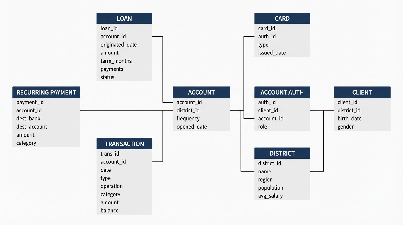
For this post I'm focused on the transaction table, but having the full relational model available means we can do much richer analysis later.
Loading the Data
import pandas as pd
import matplotlib.pyplot as plt

df = pd.read_csv('transaction.csv')
print(f"Records: {len(df):,}")
df.head()
Records: 1,056,320
   trans_id  account_id        date    type     operation category  amount  balance
0    695247        2378  1993-01-01  credit  cash_deposit      NaN   24.01    24.01
1    171812         576  1993-01-01  credit  cash_deposit      NaN   30.86    30.86
2    207264         704  1993-01-01  credit  cash_deposit      NaN   34.29    34.29
3   1117247        3818  1993-01-01  credit  cash_deposit      NaN   20.58    20.58
4    579373        1972  1993-01-02  credit  cash_deposit      NaN   13.72    13.72
Over a million records. Each row has a transaction type (credit, debit, or cash withdrawal), an operation describing how the money moved (cash deposit, wire in, wire out, card purchase), and a category for the purpose when available (interest, loan payment, household bills, insurance, pension).
Transaction Types
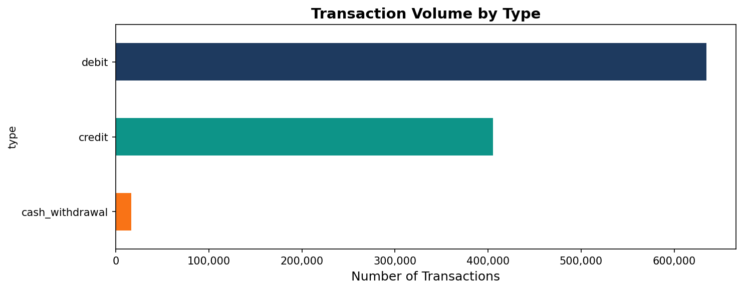
df['type'].value_counts()
debit              634,571
credit             405,083
cash_withdrawal     16,666
About 60% of all transactions are debits, 38% are credits, and the remaining 2% are cash withdrawals at the counter. For every deposit there are roughly 1.6 outflows.
df['type'].value_counts().plot(kind='barh', figsize=(10, 4), color=['#1e3a5f', '#0d9488', '#f97316'])
plt.xlabel('Number of Transactions')
plt.title('Transaction Volume by Type')
plt.tight_layout()
The operation column adds more detail on how money moved.
df['operation'].value_counts().plot(kind='barh', figsize=(10, 5),
    color=['#1e3a5f', '#2d5a8e', '#0d9488', '#3bb5a8', '#f97316'])
plt.xlabel('Number of Transactions')
plt.title('Transaction Volume by Operation')
plt.tight_layout()
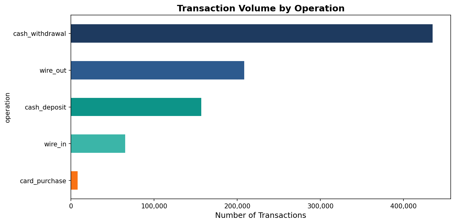
Cash transactions dominate. Card purchases are only 8,000 out of over a million records. This was the 1990s, before cards became widespread. A community bank today would show the inverse, but the underlying pattern of credits versus debits holds.
Day of Week
df['date'] = pd.to_datetime(df['date'])
df['day_of_week'] = df['date'].dt.day_name()

df.groupby('day_of_week')['amount'].agg(['count', 'sum']).reindex(
    ['Monday', 'Tuesday', 'Wednesday', 'Thursday', 'Friday', 'Saturday', 'Sunday']
)
              count        sum
Monday       151,553  29,838,918
Tuesday      153,516  30,004,452
Wednesday    145,158  29,505,702
Thursday     148,410  29,951,520
Friday       149,919  29,898,696
Saturday     158,499  30,272,169
Sunday       149,265  30,015,007
df.groupby('day_of_week').size().reindex(
    ['Monday', 'Tuesday', 'Wednesday', 'Thursday', 'Friday', 'Saturday', 'Sunday']
).plot(kind='bar', figsize=(10, 5), color=['#1e3a5f']*5 + ['#f97316']*2)
plt.ylabel('Transactions')
plt.title('Transaction Count by Day of Week')
plt.tight_layout()
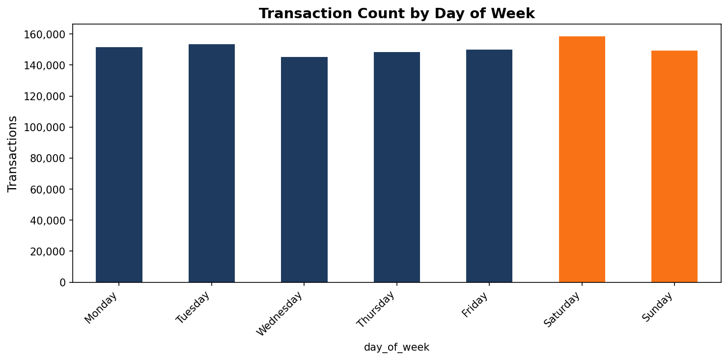
The distribution is surprisingly flat across the week. Saturday actually has the highest count, which seems wrong until you look at what's happening. Batch processing. Interest credits and account fees post on Saturdays. These are not clients walking into branches on the weekend. They are system-generated entries. That's the kind of thing that only becomes visible when you look at the data.
Amount Distribution
df['amount'].describe()
count    1,056,320
mean        198.32
std         320.08
min           0.00
25%           4.57
50%          69.41
75%         227.97
max       3,183.49
The median is $69 while the mean is $198. That gap tells you the distribution is right-skewed. A small number of large transactions pull the mean up.
df[df['amount'] < 500]['amount'].hist(bins=50, figsize=(10, 5), color='#0d9488', edgecolor='white')
plt.xlabel('Amount ($)')
plt.ylabel('Frequency')
plt.title('Transaction Amounts Under $500')
plt.tight_layout()
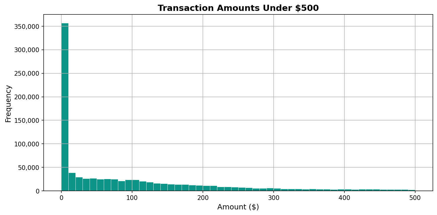
Filtering to transactions under $500 shows the shape clearly. A massive spike at small amounts, then a long tail. The 25th percentile at $4.57 represents the everyday small transactions that make up the bulk of activity.
What Normal Looks Like
The point of this kind of exploration is not to find anything dramatic. It is to build a picture of what normal looks like. When you know that debits outnumber credits roughly 1.6 to one, that Saturday batch processing inflates the weekend numbers, that the median transaction is $69, you have a baseline.
That baseline is what makes anomalies visible later. A sudden spike in large wire transfers, an unusual pattern on a quiet day, a shift in the credit-to-debit ratio. None of those stand out unless you know what the regular pattern is. Understanding normal is the first step toward catching what isn't.